|
"Usability in the real world: assessing medical information technologies in patients' homes" |
|
 |
| Summary |
Here is the methodology for how you should study the usability of medical systems in patient homes, and how to design and re-design those systems. It is a dual combination of cognitive walkthrough and field testing. The cognitive walkthrough measures task complexity and anticipates user problems. The field research, although very expensive and time-consuming, allows you to see the human-computer interaction in a natural setting and approximates actual use. |
| Cool things |
Possible cultural shift: patients will become their own care-givers and have much greater responsibility for their own health. This means the healthcare system has to switch from acute care to chronic care, and encourage patient self-management. This means patients will need easy access both to relevant clinical data and their own data. |
| Cognitive walkthrough (CW) |
Purpose: determine whether the user's background knowledge and the interface are enough to correctly perform a task. It's also for evaluating the cognitive processes of users performing a task |
| Theory |
Implementation |
| Goal-action structure: the codes for analysis are made up of goals, which are divided into subgoals and actions, and each has a system response. |
The IDEATel project is a home-telemedicine system. The goals of this is to help poor Hispanic people in New York manage their diabetes with a home telemedicine system. For example, a goal and subgoals are are:
- Measure blood glucose
- Subgoal: begin measurement
- Action: press blue power button
- System response: meter displays last blood glucose value
|
| Task simulation is done by "walking through" the sequence of actions to perform a goal |
Although the "think aloud" part is in theory the user using the machine alone, in this project, it more resembled a conversation between the reseacher and the patients. The CW found parts of the tasks that are likely to be problematic or make excessive demands of a typical user. |
| Field usability testing |
Theory |
Implementation |
| Purpose: to evaluate whether a system satisfies basic usability criteria for target participants. CW and usability testing should be coupled. The CW should finds the procedural characteristics of the task, and the usability testing characterizes the population using the system.
|
| Development and selection of tasks: outline the task, objective, and procedures for user testing |
The 5 common tasks from the CW were used. They had the subjects go through 5 tasks, which were measuring blood glucose, take their blood pressure, access a website, send an email, and change their calendar. |
| Select representative users: Do not rely on a convienence sample like power users or early adopters |
They selected people from two tiers of education and two geographic areas: people who used computers and the internet with regularity and those who did not, and people from the urban and rural areas. |
| Set up the test environment: Use a video recorder, screen recorder, audio recorder, backup audio recorder, camera guy, and field note taker. |
Subjects were visited in their home by two researchers, one of whom was a Spanish speaker and served as translator. They described the study again, gave consent forms, and reassured the participants. The users filled out a demographic survey and gave a 5-10 minute interview about their experience with computers and diabetes. One researcher interacted with the participants and the other took field notes. |
Data/Video analysis: Macroanalysis
After transcriping the audio and syncing it with the video, you should perform macroanalysis. This is where you note particular difficuluties the users are having and use it to design a better system. Usually you can stop at this step, but if you really want to, you can do microanalysis.
|
They segmented the episode by event and labeled them by their source of evidence (interview, patient, observation/field note, video of user, or video screen capture) |
Data/Video analysis: Microanalysis
- Segment events - divide the video into events. This should correspond with the goals in the CW
- Verbal and nonverbal analysis - in addition to transcribing words, you should also transcribe non-verbal movements for the users who lack the expressive vocabulary. This includes changes in body position, gestures, and gaze.
|
Basically the same thing as the macroanalysis, except in way finer granularity. They contrast two patients: both are Hispanic, have little experience with computers, and had been in the diabetes intervention for a year. However, the first woman had a great amount of trouble with the system, while the second gained mastery fairly quickly. This is probably because the second had more education, and more social support because she had a son who would sometimes provide assistance. |
| Final |
The healtcare system is going to change. Patients with chronic conditions are going to become their own caregivers and assume responsibility for their own healthcare. |
|
"Designing Human-centered Distributed Information Systems" |
|
 |
| Summary |
This paper lays out the methodology to designing EMRs based on human-centered computing (HCC). Wow, how do we do that? With human-centered distributed information design (HCDID). |
| Key equation |
Human-centered distributed information design (HCDID) = distributed congnition + the four levels of analysis |
| Methology |
Distributed cognition |
People behave intelligently and process information in information-rich environments filled with natural and articial objects, human and non-human agents. Their actions are guided by social and physical context of that environment. |
| Analysis level 1: Users |
Identify the user characteristics as group: do skill and knowledge overlap, do different groups have different communication channels that can lead to misunderstanding, does division of roles affect cognitive capability? |
| Analysis level 2: Functions |
Find the top goals, but also identify the articical and human agents, their roles, and interrelations. |
| Analysis level 3: Tasks |
Use hierarchical task analysis (subdivide a big task into smaller sub-tasks) to find the required system functions. These tasks can be shared among human and artifical agents and spread over physical space and time! Make sure to match functions to user capabilities. |
| Analysis level 4: Representational or Inferface |
A display should contain the exact amount of information for a task -- no more and no less. |
| Rule of triples |
the person, machine, and context. This is also the unit of analysis for cognitive engineering and computer science |
| Take away message |
EMRs should be designed to help humans but you got to go about it the right way! This is a huge system spread over time, space, and multiple brains. |
|
"TURF: Toward a unified framework of EHR usability" |
|
 |
| Turf |
Turf is made up of 4 components: Task, User, Representation, and Function. |
| Definitions |
ISO
| Turf
|
| Effectiveness - accuracy and completeness that users achieve goals |
Usefulness - how well the sustem supports the work domain that users accomplish goals |
| Efficiency - resources expended to achieve effectivness |
Usefulness - a systen is easy to learn, efficient to use, and error-tolerant |
| Satisfaction - comfort and acceptability of use |
Satisfaction - subjective impression of how useful, usable, and likeable the system is |
| Summary |
This is an extension of the 2002 IEEE paper. TURF is a initial form of a unified framework of EHR usability. The properties are:
- Describing, explaining, and predicting usability differences
- Defining, evaluating, and measuring usability objectively
- Designing built-in good usability
|
| Summary |
Task - task analysis is the last step |
Task analysis consists of identifying the steps of carrying out a task by using specific representation, the relationship between steps, and the nature of each step (mental and physical). Keystroke level modeling (KLM) estimates time on task, task steps, and mental effort. |
| User - user analysis is the first step |
Identify the types and characteristics of target users, such as experience and knowledge of EMR, knowledge of computers, education, cognitive capabilities and limitations, skills, personality |
| Representation - representation analysis is the third step |
Evaluate the appropriateness of the representation for a given task. You can do by comparing a representation with isomorphic representations, or expert review. |
| Isomprphic representations are functionally equivalent but computationally different. For example, "write a prescription" can be done with a paper and pencil, with a phone call to the pharmacy, or on the e-prescribing on the computer. |
Metrics for usefulness:
- Within-model domain function saturation - measures the percent of functions in the EMR that are considered useful by users, ie, the ratio of number of functions in the EMR that are in the ontology over all the functions in the EMR
- Across-model domain function saturation - measures the percent of total functions implemented by the EMR that are considered useful for users, ie, the ratio of number of functions in the EMR over all the functions total
- Across-model function saturation - measures the percentage of functions in the EMR tht are proposed by designers, wanted by users, and used in activities, ie, the raio of all functions in the EMR over the total number of functions
|
| Affordance is the set of allowable actions specified by the display coupled with the knowledge of the user. For example, a well-designed button has high affords clicking. However, a hyperlink embedded in text without a change in color or underlined blue link does not afford action clicking. |
| Heuristic evaluation or expert review of usability is also efficient and generates good results. |
| Function - function analysis is the second step |
Identify the ontology of the work domain, the essential requirements of the work independently of technology systems. It has four components: goal, objects, operations, and constraints
- Designer model - set of functions that are implemented in the EMR
- User model - set of functions the user wants
- Activity model - set of functions that are actually used be users
|
| Final thoughts |
This paper also promises that TURF is a way to not only evaluate EMRs, but also design EMRs for better usability. But there wasnt not much about that in the paper. |
|
"Toward a Psychological Science of Advanced Technology Design for Older Adults
"
|
|
 |
| Psychology in design technology |
How has psychology and aging affected design technology?This paper addresses 3 issues:
- understanding what people need
- identifying their preferences for design characteristics
- defining their capabilities and limitations that will influence technology interactions
|
| Myths and realities about older people and technology |
Statement
| Clarification
|
| Some adults are more tech-savy than others |
True: When 65-75 year olds were tracked during a 10-day period, "low-technology users" had 190 technology interactions, while "high-technology" users had 301 technology interactions. This include not only computers and smartphones, but also radios, microwaves, exercise equipment, landlines, etc. |
| Younger people use technology more than older people |
True:
|
| People will use a technology if they think they need to use it |
True:
- This is already true for young people
- Older people are increasingly using the internet, cell phones, GPS, and social networks
- Older people respond positively to technology in their homes, with 62% likes and 38% dislikes.
|
| Trends in the aging and technology field |
Goal: replace the age variable with an understand of the source of age-related differences |
Chronological age is predictive of usage patterns, but it does not explain why these differences occur.
|
| Goal: Matching psychological needs with design features |

|
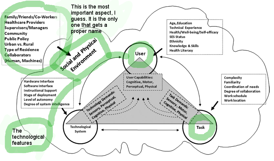
This model is based on the 1973 Lawton and Nahemow model. Performance is based on:
- Demands of the environment
- Individual capabilities
|
This models says that performance depends on:
- Demands of the environment
- Individual capabilities
- Task being performed
- Hidden fourth diminsion: the context in which the task is performed
|
| Goal: Guidance (and more importantly, translation) for design |
Fisk wrote a 2004 textbook called Designing for Older Adults : Principles and Creative Human Factors Approaches. This showed how design guidelines could be derived from age-related changes in motor control, perceptual function, and cognitive ability.
|
| Jastrzembski and Charness (2008) took variables such as eye-fixation duration, movement time, verbal working memory span, and the power law of practice in both young and older people. Then they were able to predictct performance differences in the use of a cell phone. Whaaaaaa???
|
| Usability testing |
| Identifying source of usability difficulties |
One |
| Assessing the adequacy of manuals and tutorials |
Two |
| Understanding unmet needs |
Three |
| Robotics and constant sensors |
Topic
| Ideas
|
| Definitions |
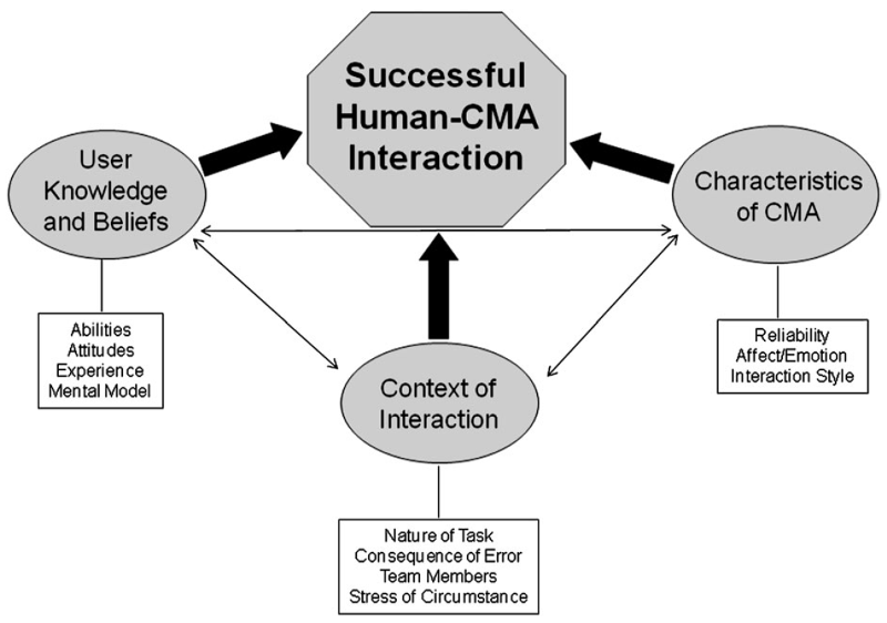
This paper uses the phrase "ambient technology" to mean ubiquitous computing, embedded technologies, sensors etc, that can adapt to a user. Collaborative machine assistants (CMAs) are virtual agents or a robots.
|

|
| General notes |
- When making error messages, they should be specific and not just say "general error has happened."
- There are privacy concerns, but they are willing to overlook them if you provide good care/service for them
- number and nature of team members
- stress of interaction
|
| Context of the interaction |
Interaction here contains:
- nature of the task
- consequence of an error
- number and nature of team members
- stress of interaction
The example used here was an adaptive computer assistant for personalized diabetes care. If the format of advice was adaptive to the task, it was more effective with dealing with critical situations than non-adaptive advice-giving computer assistants.
|
|
"Toward a Psychological Science of Advanced Technology Design for Older Adults
"
|
|
 |
| Definitions |
The word "affordance" was invented by the psychologist J.J. Gibson in 1977. It means "the actionable properties between the world and an actor (a person or animal)." These relationships exist naturally. But this refers to perceived affordances, not real affordances. What is the difference?
- Perceived affordance: designed while thinking about what actions the user perceives to be possible
- Real affordance: what actions are actually possible
|
| Title |
Statement
| Clarification
|
| Column 1 |
Text
|
| Column 1 |
Text
|
| Column 1 |
Column 2 |
Chronological age is predictive of usage patterns, but it does not explain why these differences occur.
|
| Title 2 |

|
| Column 2
|
This models says that performance depends on:
- Demands of the environment
- Individual capabilities
- Task being performed
- Hidden fourth diminsion: the context in which the task is performed
|
| Column 2 |
Text
|
| Text
|
| Column 3 |
| Unit 1 |
One |
| Unit 1 |
Two |
| Unit 1 |
Three |
| Row |
Topic
| Ideas
|
| Definitions |
This paper uses the phrase "ambient technology" to mean ubiquitous computing, embedded technologies, sensors etc, that can adapt to a user. Collaborative machine assistants (CMAs) are virtual agents or a robots.
|

|
| General notes |
- When making error messages, they should be specific and not just say "general error has happened."
- There are privacy concerns, but they are willing to overlook them if you provide good care/service for them
- number and nature of team members
- stress of interaction
|
| Context of the interaction |
Interaction here contains:
- nature of the task
- consequence of an error
- number and nature of team members
- stress of interaction
The example used here was an adaptive computer assistant for personalized diabetes care. If the format of advice was adaptive to the task, it was more effective with dealing with critical situations than non-adaptive advice-giving computer assistants.
|
|
"Evaluating User Perceptions of Mobile Medication Management Applications With Older Adults: A Usability Study"
|
|
 |
| Overall message |
It is important to understand the differences between individuals who have, who will, and who will never adopt mHealth technologies.
|
| Introduction |
Statement
| Clarification
|
| Medication adherence is a problem
|
- Half of prescriptions not taken
- One half of patients with chronic conditions like diabetes, hypertension, and dyslipidemia will stop taking their pills after one year
- Adherence interventions can be as simple as blister packs and 7-day pill boxes
- But if you want real clinical improvement, you need fancy things like patient education, patient self-management, pharmacist reviews, etc.
|
| mHealth is popular
|
- 89% of individuals over age 50 use a mobile device, although most are "dumbphones"
|
| Objective
|
Explore the usability and usefulness of existing medication management applications for adults over age 50.
|
| Methods |
Method
| Clarification
|
| Design
|
Mixed methods, qualitative assessment, Systems Usability Scale (SUS)
|
| Apps tested
|
- MyMedRec
- Pillboxie
- DrugHub
- Pocket Pharmacist
- MediSafe
|
| Participants
|
35 participants aged 52-78 years, mean 67 years, 71% (25/35) female
|
| Procedure
|
- Group sessions
- Begin with snacks, mmmm snacks
- Give everyone an iPad and a set of tasks
- adding prescription, nonprescription, and natural medicines
- scheduling reminders
- recording when a dose was taken
- emailing profiles
- reading drug information
- scanning for drug interactions
- Ask the participants about these things:
- overall user experiences
- ease of use
- concerns over the potential for data input errors
- perceived quality of the information provided
- preferences for different features
- expected adoption by adults over age 50
- Rate each application on a scale of 0-100 with SUS
|
| Results |
Category
| Clarification
|
| SUS scores
|
- DrugHub, 57.1
- MyMedRec, 55.6
- Pillboxie, 52.2
- PocketPharmacist, 42.1
- MediSafe, 15.1
|
| Qualitative results
|
When asked, the participants said:
- frusterating, but fun
- feel vulnerable, do not want to try trial and error
- some became comfortable inputting, some became frustrated and gave up
- some wanted to continue, some did not want to continue
|
| Challenging features
|
These are what the people had trouble with:
- plus + button
- back
- cancel
- scrolling
- autocorrect
- audio reminders
- inconsistent terminology
- sample text
- peripheral buttons
|
| Conclusion |
Dr Everett Koop famously said, "Drugs don't work in patients who don't take them." Similarly, mobile medication management applications will not work for users who do not use them.
|
|
"Older adults talk technology: Technology usage and attitudes"
|
|
 |
| Overall message |
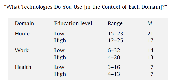
113 older adults participated in 18 focus groups discussing their use of and attitudes about technology in the context of their home, work, and healthcare.
|
| Questions |
Question
| Answer
|
| What technologies do you use [in the context of home, work, or health]?
|
What??? How are less educated people using more technologies? This makes no sense.

|
| For those of you who have used [each technology item], what do you like and dislike about using this technology [in the context of each domain]?
|

|
| Reasons for their answers |
Likes:
- Support for the technology: at home, emailing and searching for information; at work, communication
- Convenience: mostly for work; at home, health, they use the automatic phone refills instead of going to the pharmacy, and checking their glucose at home
- Features: work, eliminates hard work; health, blood pressure, pulse, and glucose machine
Dislikes:
- Inconvience: interruption, expensive, effort; for health, it is sometimes uncomfortable and you have to press and plug a lot of things
- Features: too many programming options and things to press,
- Reliability: sometimes devices do not work or break down
|
|
"Usability of an Adaptive Computer Assistant that Improves Self-care and Health Literacy of Older Adults"
|
|
 |
| Overall message |
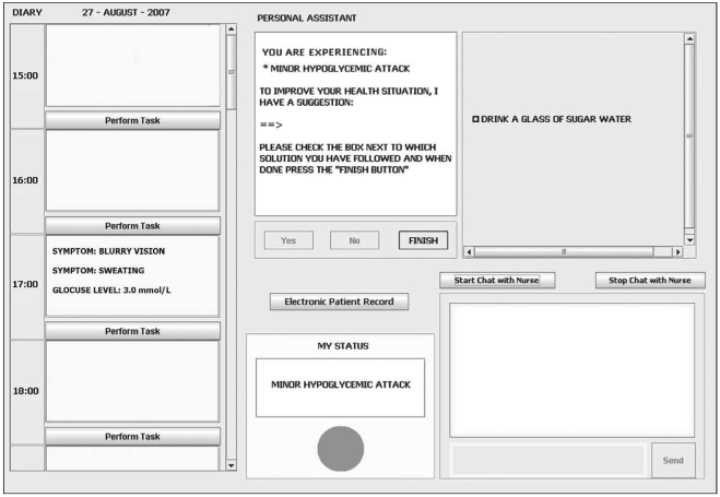
28 older adults (ages 61 to 75) did a usability evaluation of an adaptive diabetes computer assistant. It is adaptive because if the patient is really sick, it focuses on acute treatment care. If the patient is getting better, it focuses more on long-term self care. Because it is targeted to older people, they had older people test it.
They had two goals:
- Is an adaptive assisant more usable than a fixed (non-adaptive) assistant?
- Does this assisant influence health literacy?
|
| Methods |
Statement
| Clarification
|
| Here is the UI of the diabetes computer program. |

|
| Test procedure |
- Measure the participants psycholoical profile or whatever
- Make up 8 tasks with computer, based on various real-life health scenarios
- Half of the participants did first 4 with the adaptive computer, and later 4 with the fixed
- Half of the participants did first 4 with the fixed computer, and later 4 with the adaptive
- Log their errors and time taken to complete tasks
- Make participants fill out surveys
- Measure their psychological profile again
|
| Results |
For most things measured, the adaptive and the fixed diabetes program performed the same. No preference for the adaptive assistant.
|
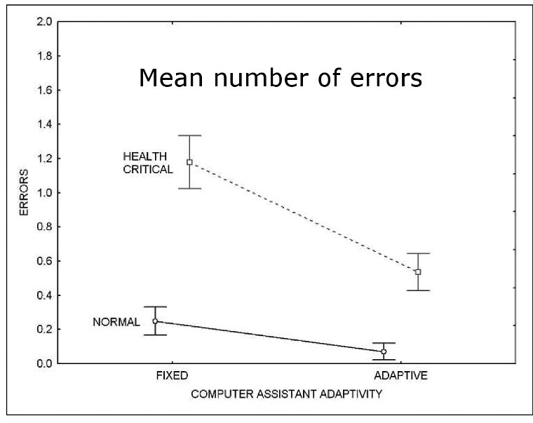
| Mean number of errors |
Under health critical situations, users made fewer errors with the adaptive computer, but it there was not much a different for normal situations.

|
|
"The Model Human Processor and the Older Adult: Parameter Estimation and Validation Within a Mobile Phone Task"
|
|
 |
| Overall message |
You should know about the older adults (>60 years) before designing things for them.
- Bridge the gap between the cognitive aging and human engineering design by finding the cognitive and psychomotor performance of older adults
- Generate parameters of interest
- Validate those parameters
|
| Introduction |
Statement
| Clarification
|
| Historical model
|
Card, Moran, and Newell (1983) made the first Model Human Processor: cognitive, perceptual, and motor. But it was for younger people, specifically, undergraduates who only volunteered because they would get extra credit.
|
| Their model
|
Their Model Human Processor: cognitive, perceptual, motor, and general slowing effect.
|
| Parameters |
Parameter
| Clarification
|
| The Perceptual System
|
Mean image decay is 160 ms, whatever that means
|
| The Motor System
|
Motor cycling time is 150 ms, uh okay
|
| The Cognitive System
|
They can store 4 items in memory, or maybe 2?
|
| Whatever this study means
|
I dunno
|
