Three are 8 common "statistical traps." A common theme is to think about the process, or the sequence in which the data was gathered. You can get variation in inputs from: people, methods, machines, materials, measurements, and environment.
Trap 1: Treating all observed variation in a time series data sequence as special cause. Is the process that produced the first number different from the process that produced the second number?
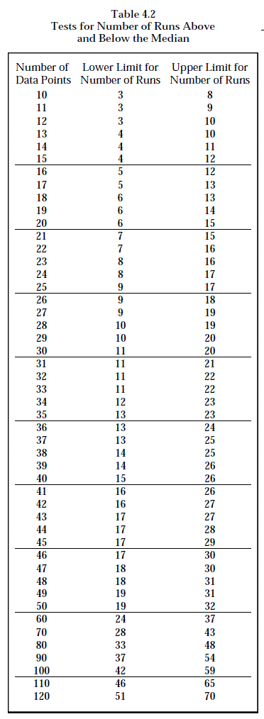
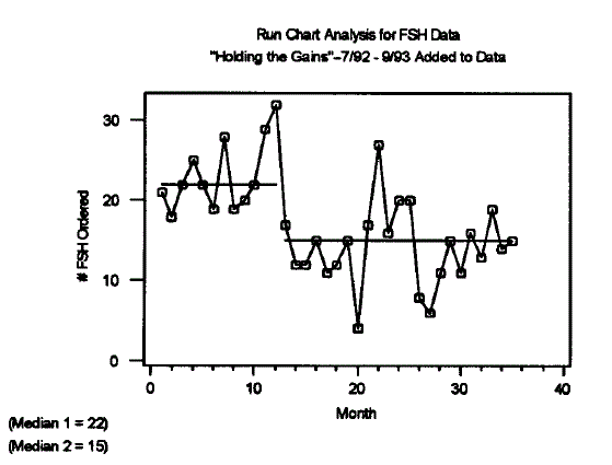
It should be a statistical reflex to draw a run chart with a median drawn in. A run chart assesses the stability of a process. A run is 8 points all above or all below the median. Generally, a successful intervention should have fewer than expected runs.
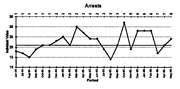
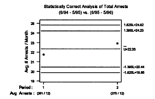
This graph has 24 months of data, no trends, no runs of length 8, and there are 8 runs and 6-14 are expected. This is common cause variation.This funny chart compares the two years within the context of common cause. It is common cause because of points are inside the outer lines. It tells the same story as the much more easily understood run chart.
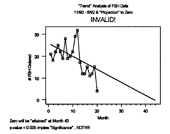
Trap 2:Fitting inappropriate trend lines to a time series data sequence. It is not always right to find the regression between two points, if the two points are from two different processes. You have to use process-oriented thinking. More changes happen in a step fashion than linear trends.
What is a trend? A trend indicates a trend in the process average. A trend is a sequence of 7 or more points continuously increasing or continuously decreasing.
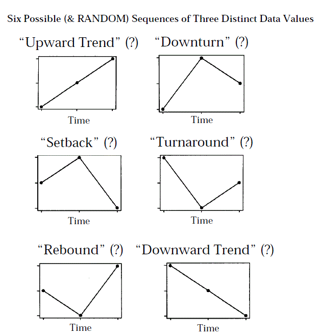
Not trends.
The computer tells us that the p value is significant, but the regression analysis is not appropriate.This shows that there are two individual processes.
Trap 3: Unneccessary obession with the normal distribution. Other common distributions include the binomial (I used that one once!).
If 51 people flipped a coin 50 times, the average number of heads would be 25. However, the individual numbers would range between 14 and 36, a 2.5 fold difference. But looking for outliers is not appropriate, because everyone had the same process and looking at outliers does not change this fact.
Before you test something for normal distribution and do an ANOVA, you should plot the points first.
Trap 4: Inappropriate calculation of the standard deviation and "sigma" limits. If you do look for outliers, try using 3 standard deviations instead of 2. If you use 2, there is a 92.7% change that at least one of the 51 coin flippers would be treated as a special cause when in fact he was a common cause, just by accident. Using 3 standard deviations changes that to 14.2% chance that only one person would be mistakenly identified as a special cause.
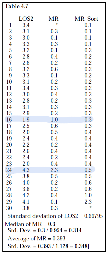
Try using a moving range, or even better, a median moving range, which is more robust to "shifts" and special cases. The median moving range tells us how far apart any two consequetive points need to be before declaring a special cause. The equation is 3.865 x (median moving range).
Something happens at point 16 and 24.
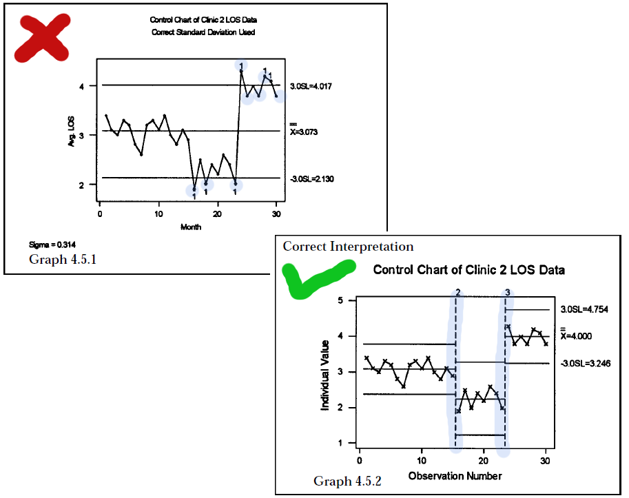
Trap 5: Misleading special cause signals on a control chart
Before you start finding special cases everywhere, check out if the process has changed. If the process has changed, then the process average has also changed, so the old control limits are no longer valid at the new process levels.
You think something special happens at point 16, 18, 23, 24, 28 and 29. But actually, the process changed at 16 and 24, and you should figure out why that happened.
Trap 6: Choosing arbitrary cutoffs for "above" average and "below" average
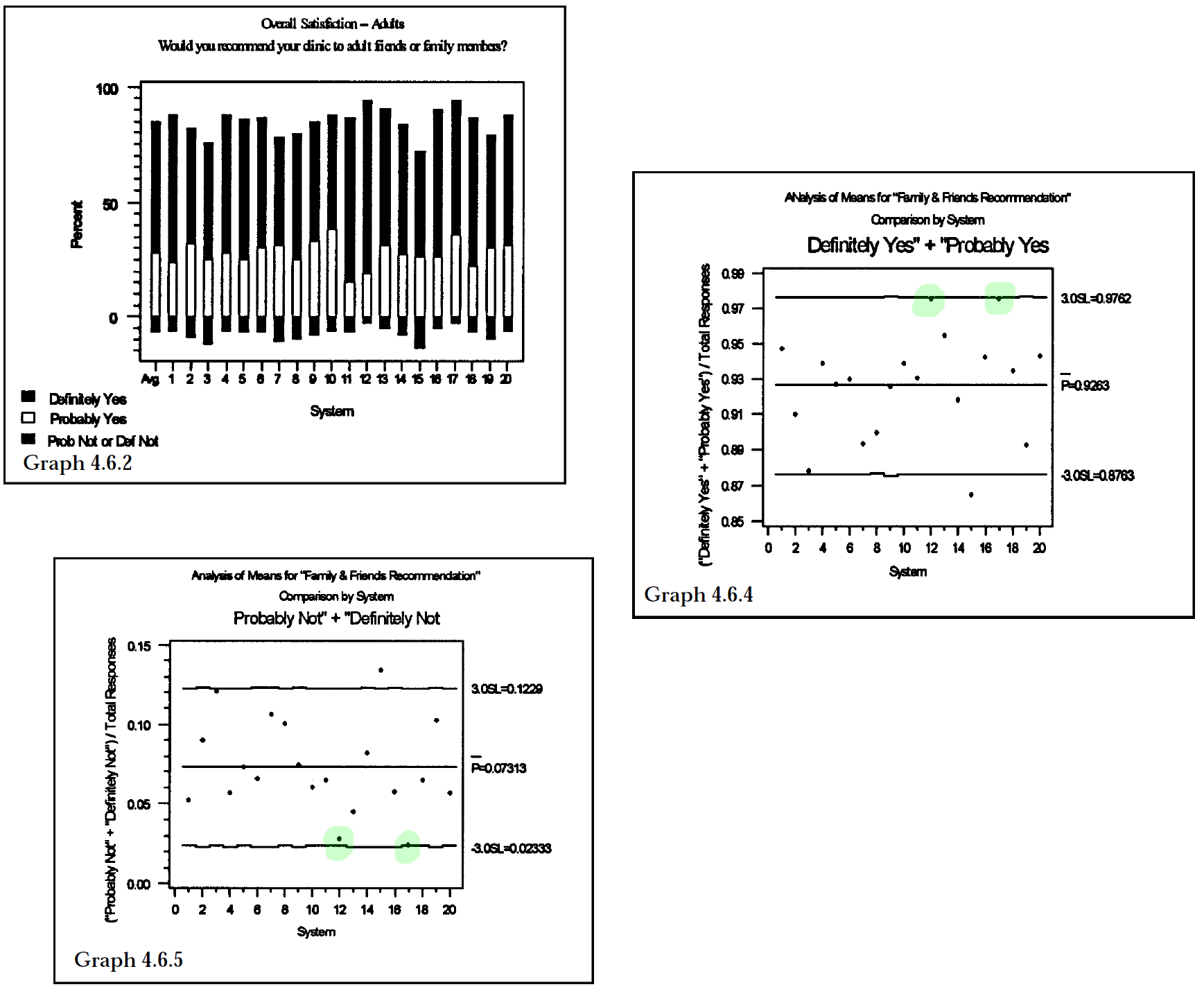
Thi is a health system ranking system, in which hospitals are ranked by if people would definitely recommend, probably recommend, probably not recommend, and definitely not recomment the hospital to their friends. It is zeroed in a the probably nots and definitely nots.
When combined, the probably and definitely yeses make up 92.6% of the responses. No systems are above the average, but 12 and 17 are close. 7.3% of people are grumblers, ie, they would probably or definitely not recommend the hospital, and no one falls below average, although 1, 4,13,17 are the least of the least satisfied.
Trap 7: Improving processes through the use of arbitrary numerical goals and standards
It seems like region 1 is doing the best, but it is not correct to say that it is completely due to the methods of the region. After all, region 1 seems "predestined" to meet the goal, but it is because of its inherent properties, management, workers, or pure luck? Why not analyze each work unit within each region?
For region 1, even though all of them meet the goal, two are below the what is statistically expected. Region 2, the worst region, has two units that are doing statistically better than expected. Region 3 has a zero gap between the goal and its average -- should everyone get a prize?
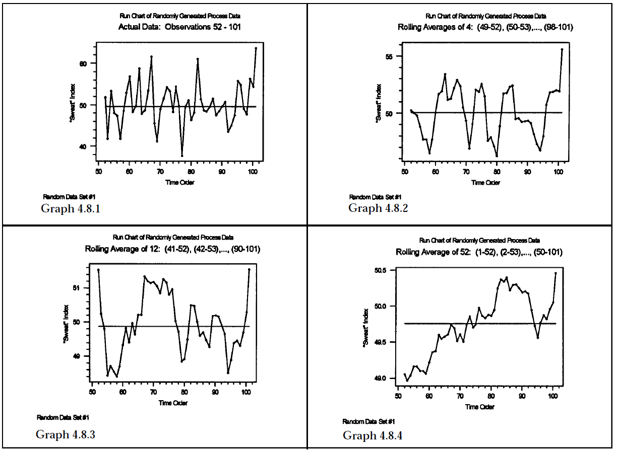
Trap 8: Using statistical technqiues on "rolling" or "moving" averages -- a lurking trap
The first graph shows the raw data. The second shows a rolling average of 4 or "four quarter rolling average", meaning that every 4 observations is averaged. The second shows a twelve month rolling average, and the last is a 52 week rolling average.
The heavier the rolling, the more dramatic the appearance of "increaes" or "decreases".